Pensieve is the result of a 3-day design sprint. The aim was to try to conceptualise a different kind of travel journal — one that encourages modes of capturing memories while travelling that don’t interfere with the user’s experience of the trip. It isn’t really a travel journal, it’s a place to return to moments that would otherwise fade.
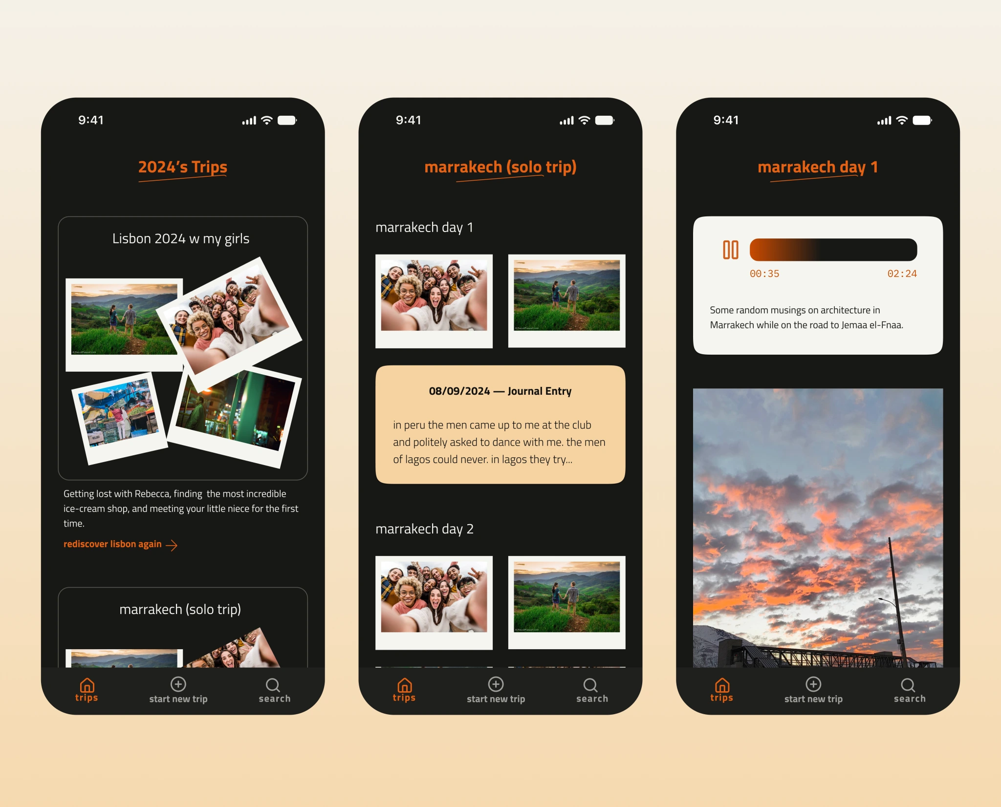
The core experience — a year’s trips, a trip broken into days, and a day’s memories: photos, a journal entry, a voice memo
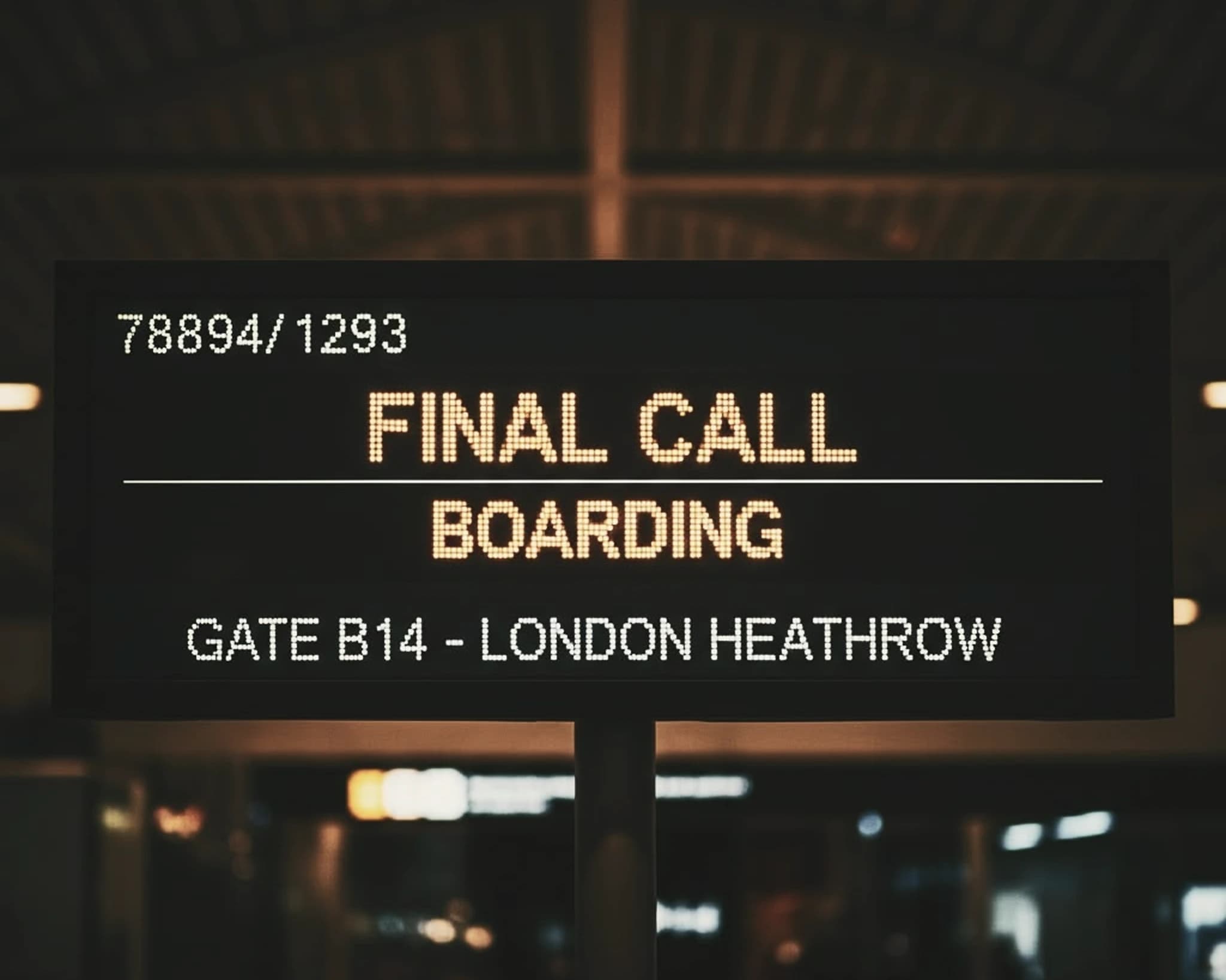
A departures board at night — “Final call, boarding, Gate B14, London Heathrow” in amber dot-matrix
What if a travel journal didn’t ask you to document your trip? Pensieve is a quiet place to keep memories — somewhere to return to afterwards, rather than another feed to perform for while you’re away.
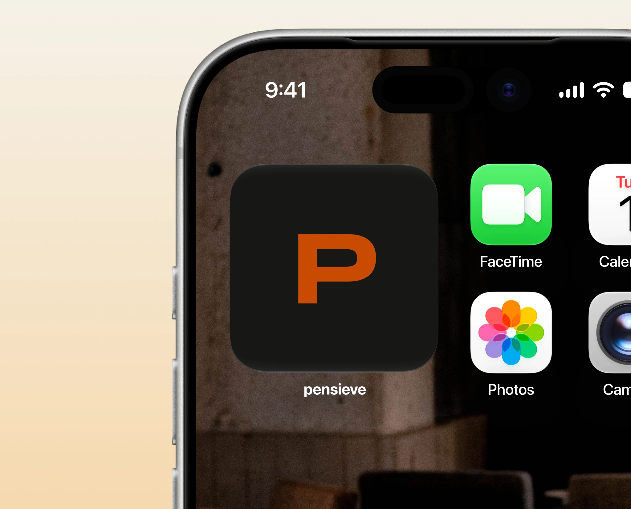
The app on a home screen — the orange “P” mark on black, labelled “pensieve”, beside the system apps
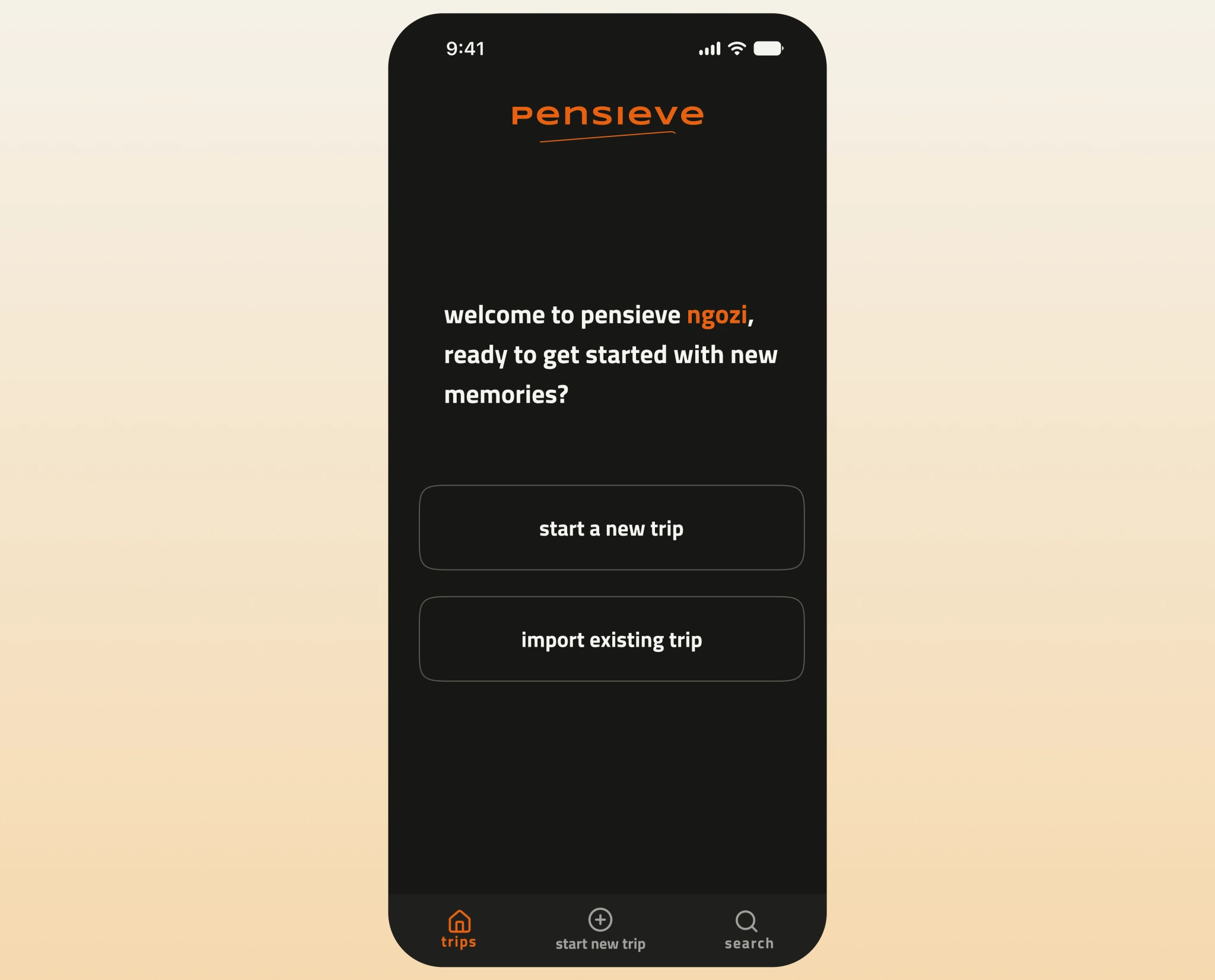
The welcome screen — the pensieve wordmark over “welcome to pensieve ngozi, ready to get started with new memories?” and two buttons: start a new trip, or import an existing one
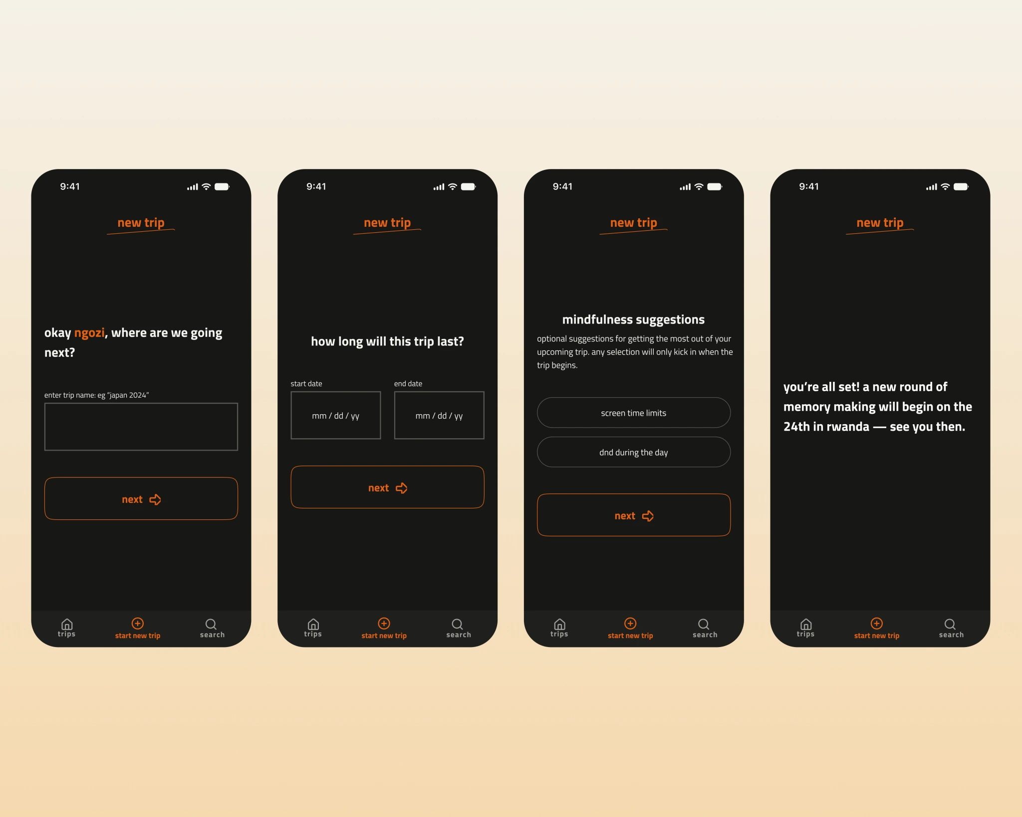
The ‘new trip’ flow — name the trip, set the dates, optional mindfulness suggestions, then a confirmation
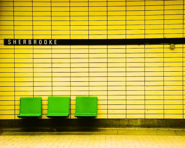
A metro station — green seats against a yellow-tiled wall beneath a “Sherbrooke” sign
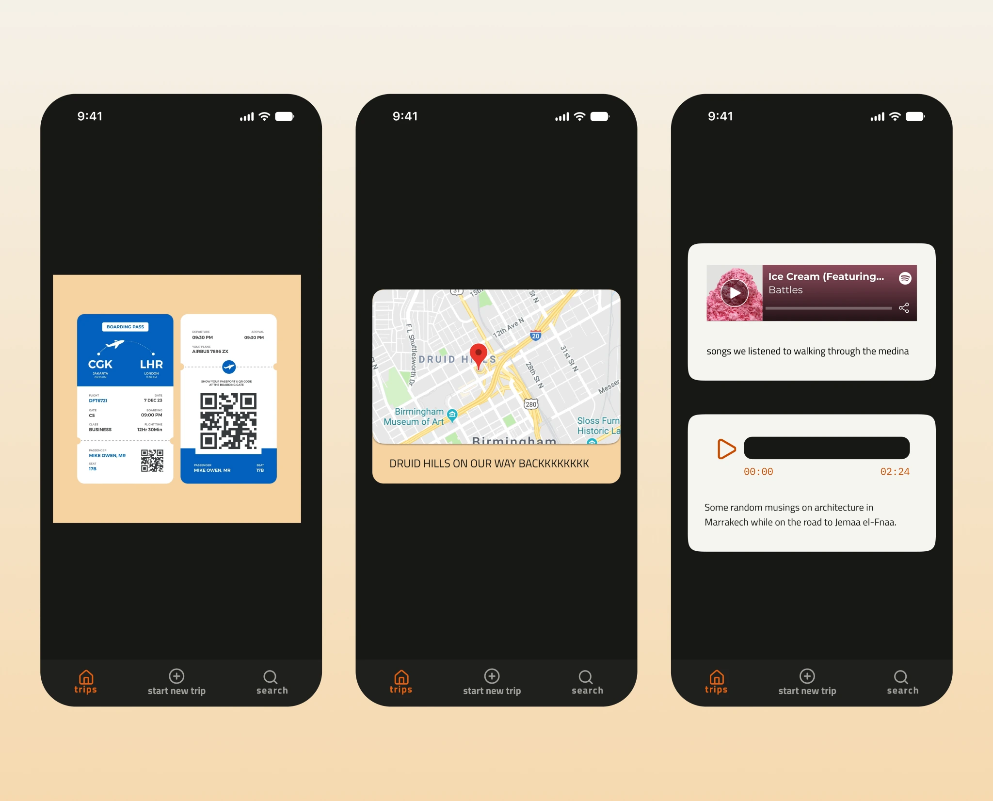
Three Pensieve memories on a warm ground — a boarding pass, a map-pinned location note, and a song paired with a voice memo
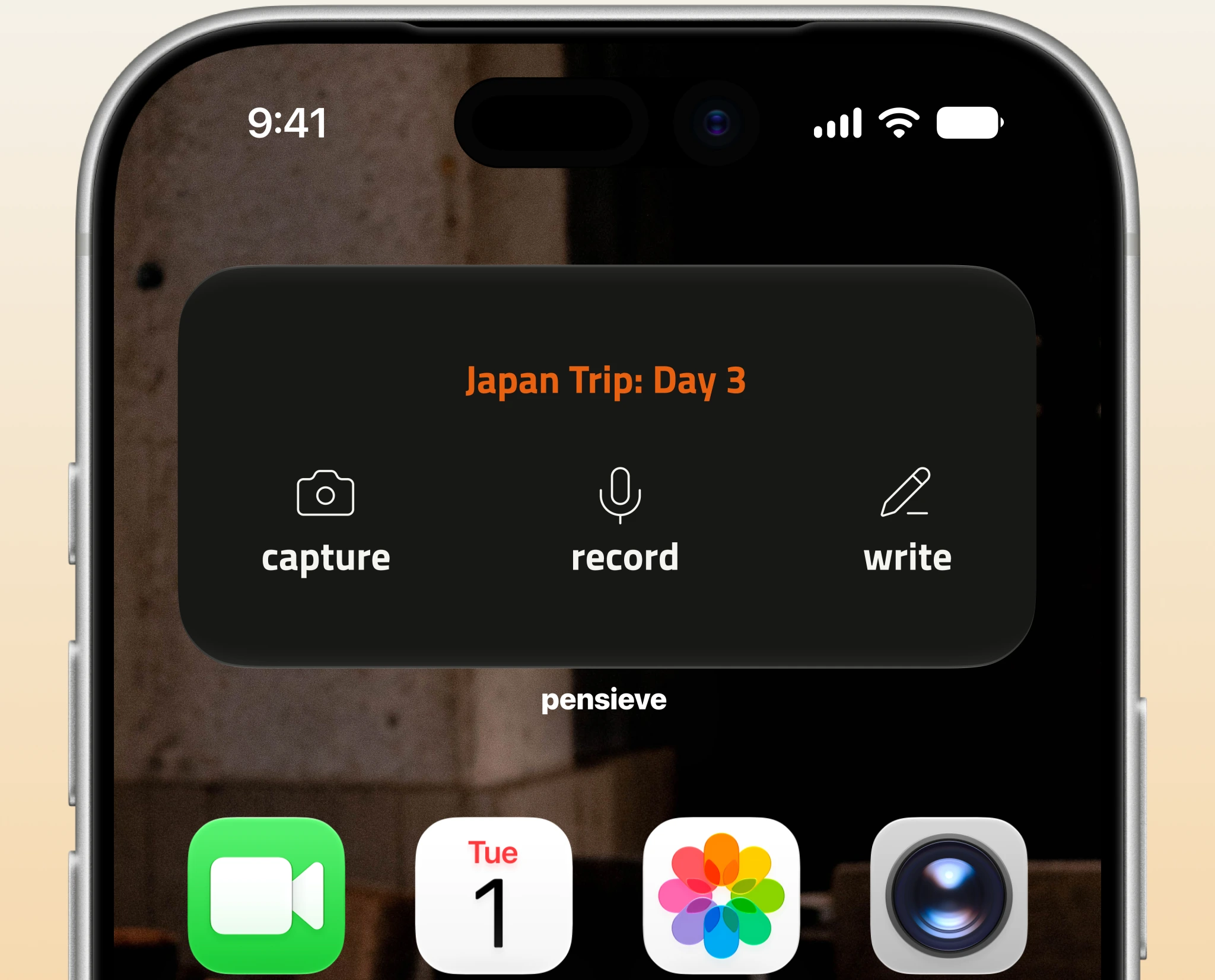
A home-screen quick action for the current trip (‘Japan Trip: Day 3’) — capture, record, or write
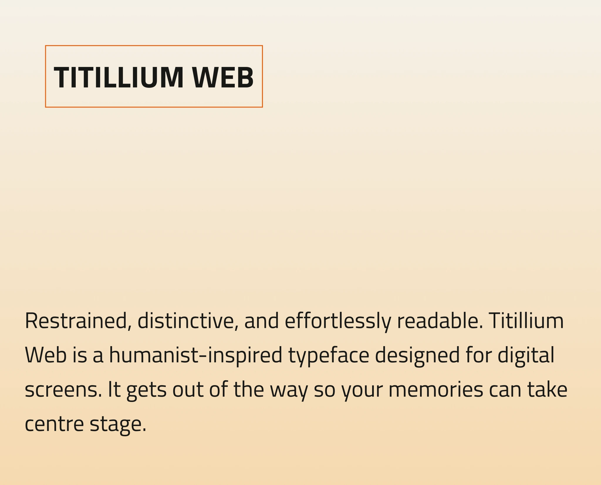
The typeface — Titillium Web, a humanist-inspired typeface designed for digital screens, shown on a warm ground
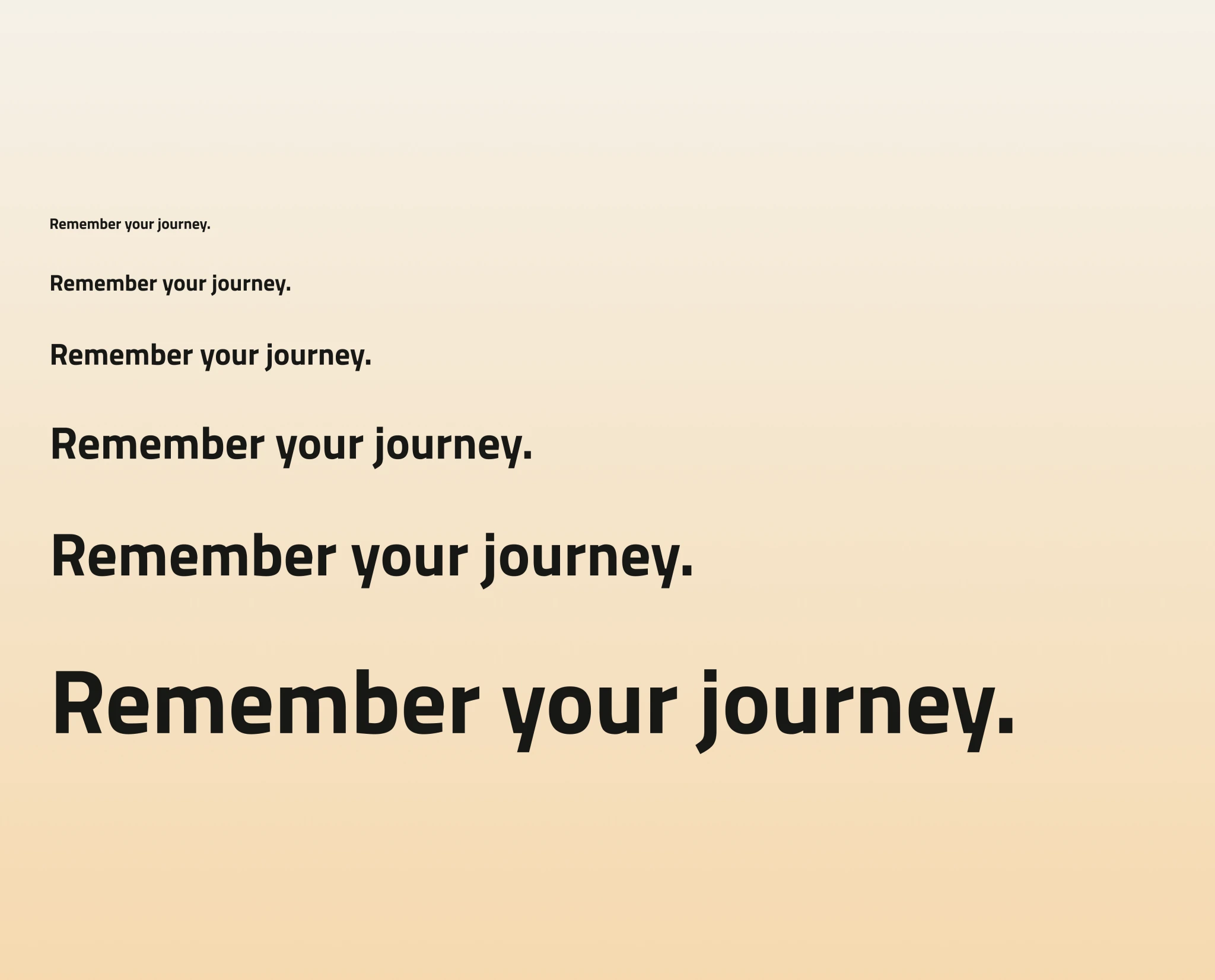
The type scale — “Remember your journey.” set from small to display across the ramp
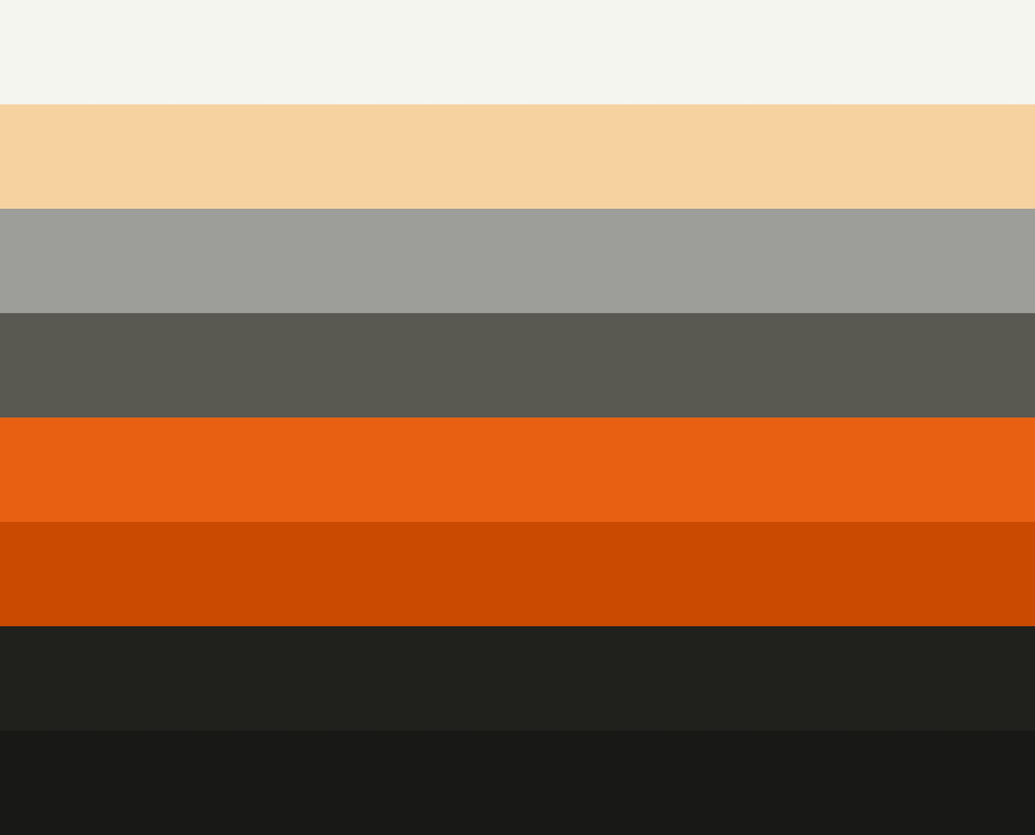
The Pensieve palette — cream, warm tan, warm grey, olive-grey, bright orange, burnt orange, near-black and black bands
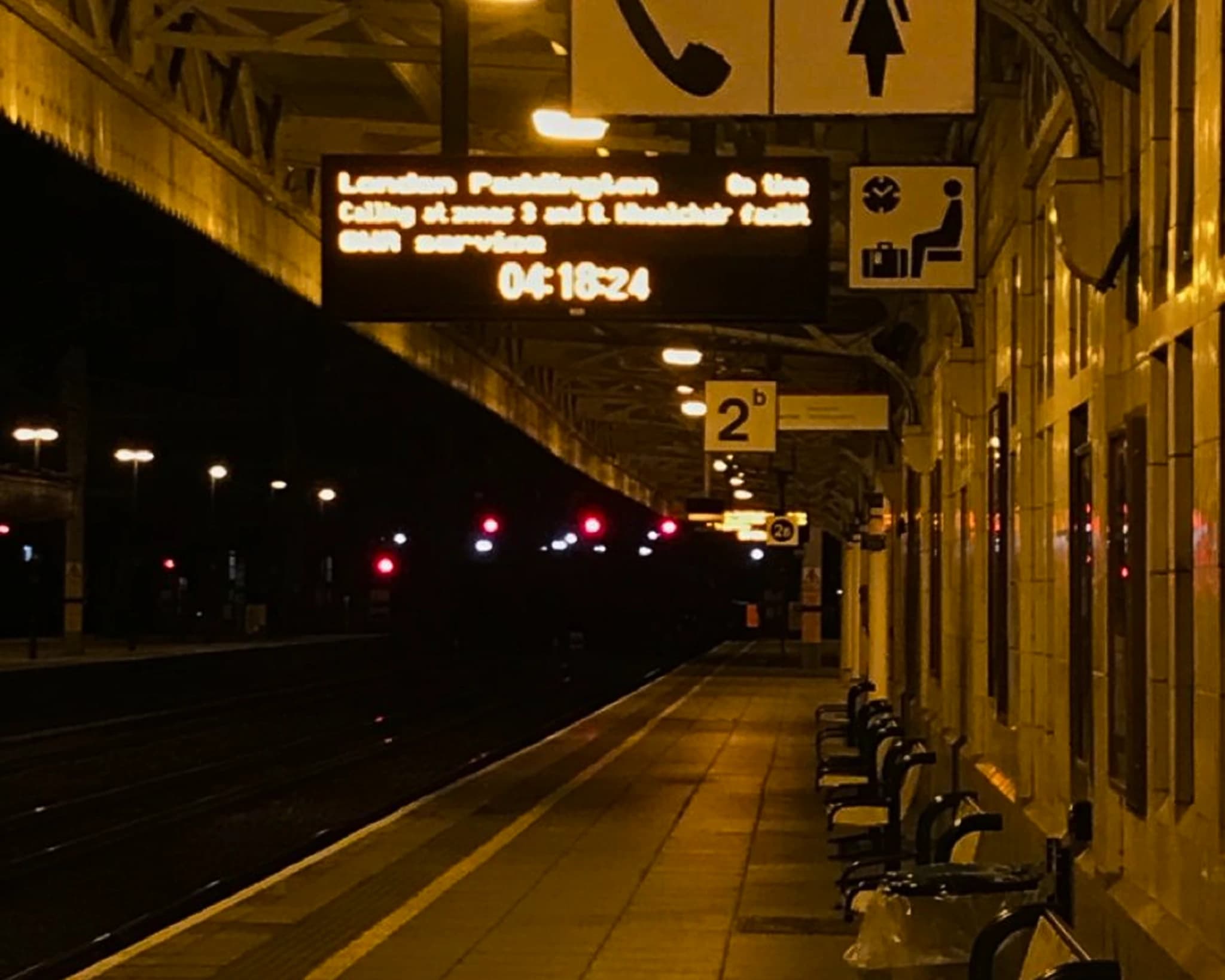
A near-empty train platform at night — a destination board reading “London Paddington”, benches along the wall
The Pensieve wordmark — lowercase orange “pensieve” with a hand-drawn imperfect underline on a near-black ground