Heyfood Checkout Redesign
PRODUCT DESIGNThe Overview
Heyfood is a food delivery platform that I used extensively after moving to Ibadan. Over time, I found myself migrating to competing products whose ordering experience felt clearer and easier to use. Eventually I settled on Chowdeck because it was better designed, more visually appealing, and frankly the mental models just made more sense (especially when it came to ordering food).
Despite that, Heyfood remained appealing because of its extensive restaurant coverage, which made me curious about how the experience might improve with a more thoughtful product design approach.
Rather than redesigning the entire app, I focused on one of its most important user journeys: checkout.
The Problem
Checkout is one of the most critical parts of a food delivery experience. It is the point at which users review information, make final decisions, and commit to a purchase.
Heyfood's checkout flow attempted to present too much information at once. Ordering details, pricing information, payment options, delivery preferences, and secondary actions all competed for attention simultaneously, making it difficult for users to focus on the decision immediately in front of them.
This is what the checkout page looked like when I started redesigning it.
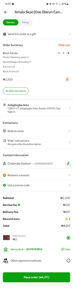
The result was a checkout experience that felt cluttered and overwhelming, increasing the likelihood that users would ignore important options or rush directly to payment without fully reviewing their order.
The Design System
Checkout is fundamentally a multivariable decision-making environment. In environments like this, it's important to manage cognitive load while still ensuring users make all the decisions necessary to complete their purchase confidently.
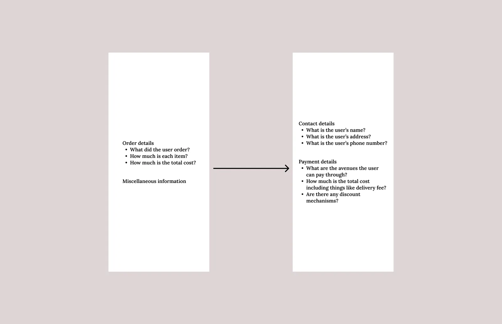
To present all the available options without overwhelming users, I first grouped the information on the screen into three categories.
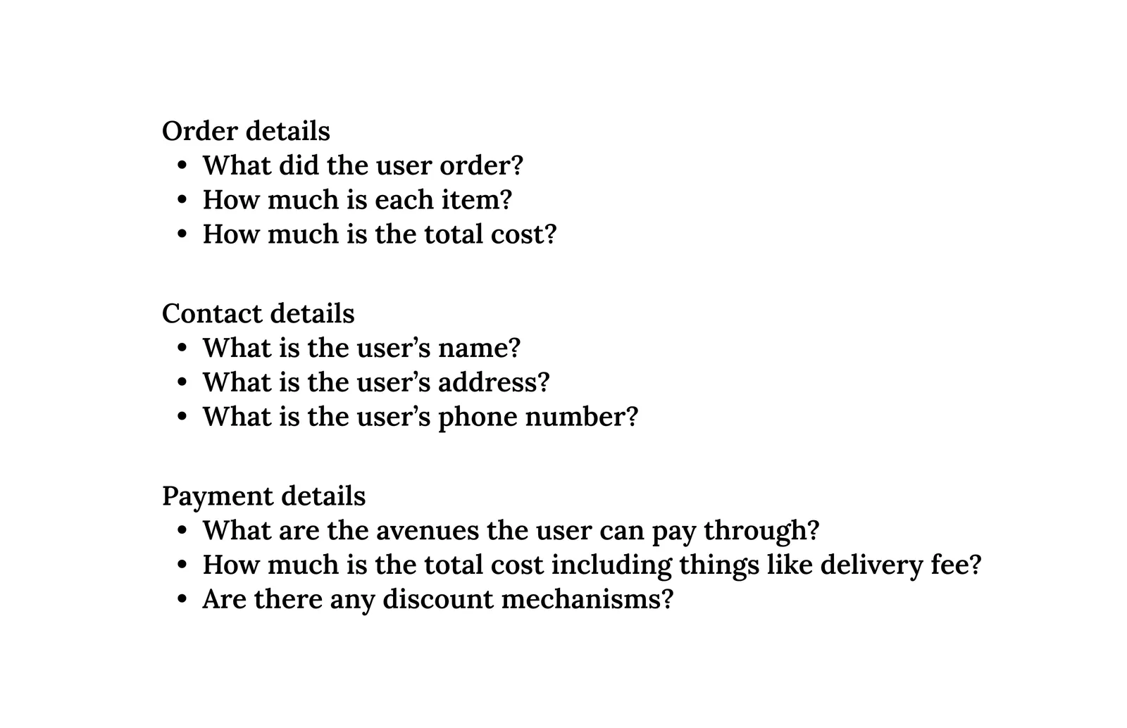
A fourth category, Delivery Details, would include information such as rider information, contact details, estimated delivery times, and live order tracking. Because this information only becomes relevant after an order has been placed, I excluded it from the scope of this redesign exercise.
Some items in the existing flow did not fit neatly into any category. Features such as Leave Instructions For The Store and Send This Order As A Gift were treated as supporting actions and handled separately within the redesigned flow.
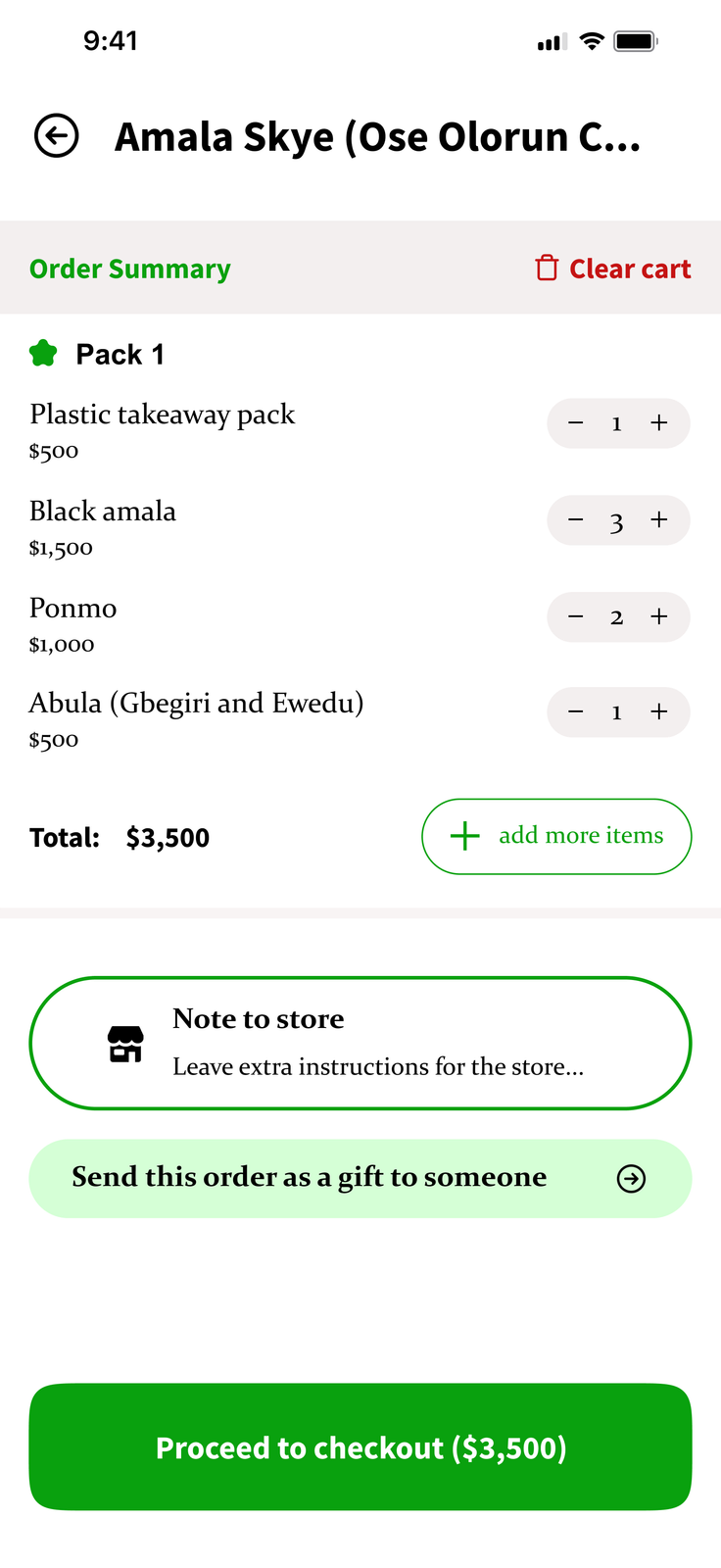
Once the information architecture became clear, splitting the checkout flow into two sequential steps became the obvious solution.
The first screen focused on reviewing and refining the order itself, while the second focused on contact details, payment information, and order completion.
I chose this structure for two reasons.
Final Review Before Commitment
I wanted users to have a final opportunity to review and adjust their order before entering payment.
Separating order review from payment creates a clearer progression through the checkout process and reduces the number of decisions users need to make simultaneously.
Supporting Alternative Purchase Paths
Actions such as sending an order as a gift introduce different contact and payment requirements.
Placing these decisions before the payment step creates a cleaner branching structure and prevents unnecessary complexity later in the flow. Users can settle on the contents of their order first before being routed into the appropriate payment experience.
The Outcome
The redesign transformed checkout from a single overloaded screen into a two-step flow organised around distinct user decisions.
The first screen focuses on reviewing and refining the order itself, while the second focuses on payment and completion. By separating these responsibilities, the flow reduces cognitive load while still surfacing all the information users need to place an order confidently.
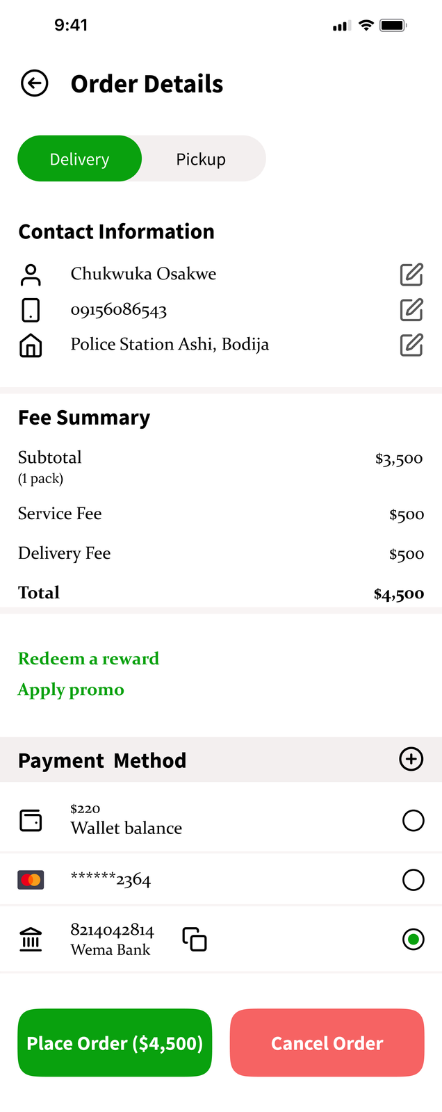
Visually, I stayed close to Heyfood's existing brand language while refining hierarchy, spacing, and typography to create a more polished and cohesive experience.
I replaced the existing typography with a pairing of Constantia and Source Sans Pro. Constantia provided a more refined reading experience for longer blocks of text, while Source Sans Pro introduced clear hierarchy for headings, labels, and key interface elements.
The result was a checkout experience that felt more structured, easier to navigate, and visually more cohesive without departing significantly from the product's existing identity.
The Reflection
This project introduced me to the idea of sequential choice architecture as a useful framework for designing information-heavy interfaces.
Rather than presenting every option simultaneously, the redesign focused on surfacing decisions at the moment they became relevant. The result was a flow that felt more structured, easier to navigate, and better aligned with the way users naturally make purchasing decisions.
This project also really made me appreciate how much typography can make or break a project, in conjunction with basic things like spacing of course. Changing the typeface elevated the design so much, and I wasn't expecting that at all.