Footy
PRODUCT DESIGNThe Overview
Footy is a football-focused Farcaster mini-app built by KMac. Designed as a hub for football communities on Farcaster, the app combined live match discussions, team notifications, Fantasy Premier League tools, and interactive matchday experiences into a single product.
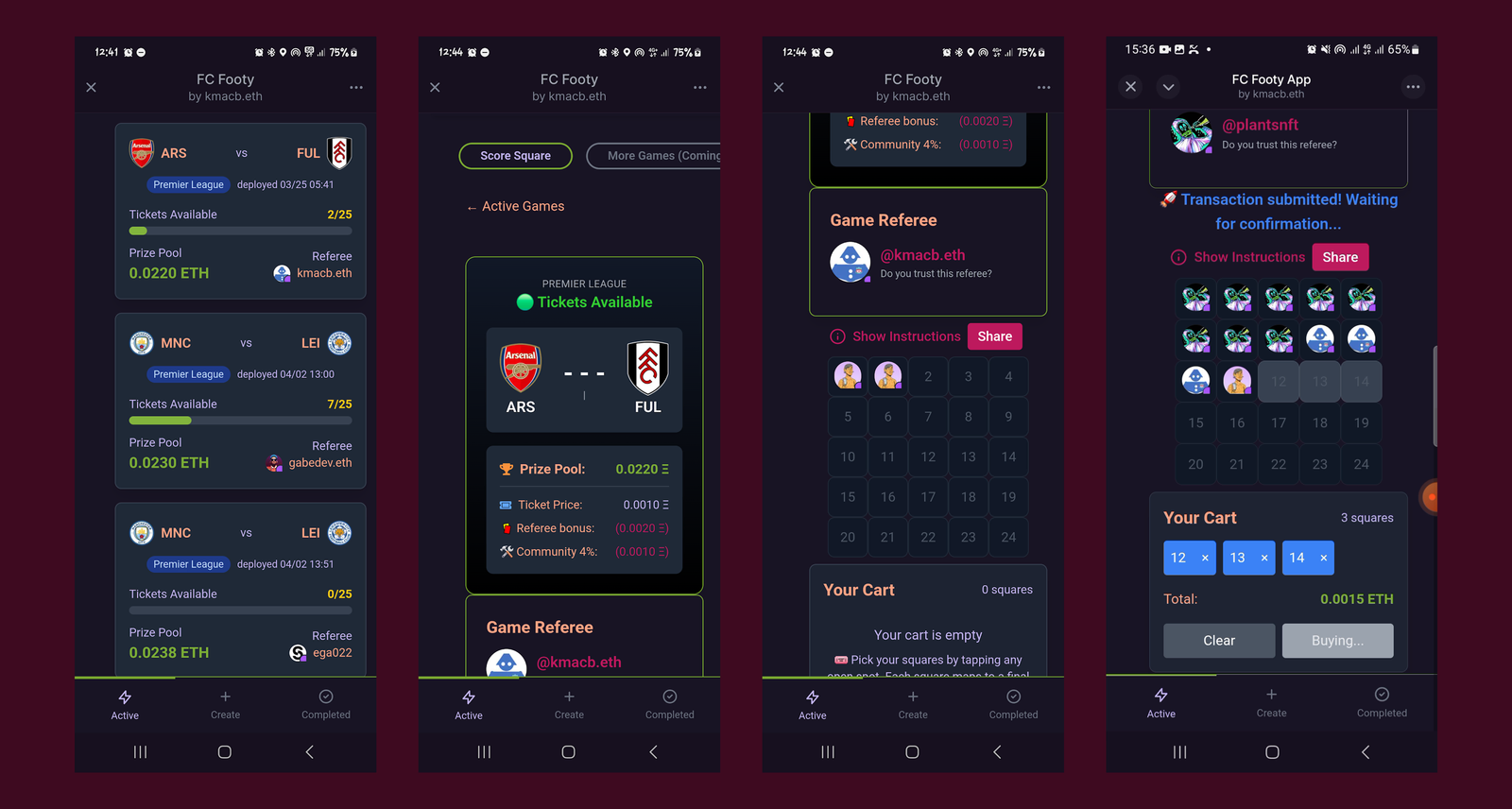
Its flagship feature, Score Square, was a prediction game where users bought squares representing possible final scores of football matches. At full time, the user holding the correct scoreline won the entire prize pool.
As Footy expanded, Score Square became the product's most important and heavily used experience — but the interface struggled with information density, inconsistent interaction patterns, and a lack of visual cohesion. My role was to redesign the experience, establish a scalable visual system, and improve clarity across the entire purchase flow.
The Problem
Footy was originally designed with functionality as the primary concern. By the time I began redesigning it, the product already worked, but the interface lacked consistency, visual cohesion, and clear interaction patterns.
I decided to focus first on Score Square, Footy's core and most heavily used feature. It represented the highest-impact opportunity to improve both usability and the overall product identity.
The Score Square experience revolved around a simple interaction model: users selected a football match, bought one or more squares representing possible final scores, and progressed through the entire purchase flow on a single screen. Rather than moving users between multiple pages, the interface relied heavily on state changes to communicate progress throughout the transaction process.
This created an interesting design challenge. The interface needed to:
- present a large amount of contextual information,
- communicate state changes clearly, and
- support fast decision-making without overwhelming the user.
As I audited the existing experience, three key problems emerged.
Information Density
Score Square compressed a significant amount of information into a small interface: match context, payout information, square selection, purchase states, and transaction feedback all competed for attention simultaneously.
Most of this information was necessary, but presenting everything at once created unnecessary cognitive load and made the flow feel harder to navigate than it needed to be.
Visual Cohesion
The visual language lacked consistency across screens and interaction states. Colours, spacing, and hierarchy shifted unpredictably throughout the experience, making related screens feel disconnected from one another.
The redesign needed a clearer and more scalable visual system that could unify the product across states and future features.
State Communication
The product depended heavily on state changes during the purchase flow. Users needed to understand immediately:
- where they were in the process,
- what action had just occurred, and
- what would happen next.
However, important transitions and feedback states were often visually disconnected from the square-selection interface itself, making the experience feel fragmented at critical moments.
The Design System
The redesign focused on making the Score Square experience easier to navigate by improving information hierarchy, system consistency, and state communication across the purchase flow.
Creating a Cohesive Visual System
With the interaction challenges clearly defined, I turned my attention to creating a more cohesive visual system for the mini-app.
The existing interface lacked consistency across colours, typography, and hierarchy, which made related screens feel disconnected from one another. Since Score Square relied heavily on repeated interaction patterns and rapid state changes, consistency became especially important — users needed the interface to feel predictable as they moved through the purchase flow.
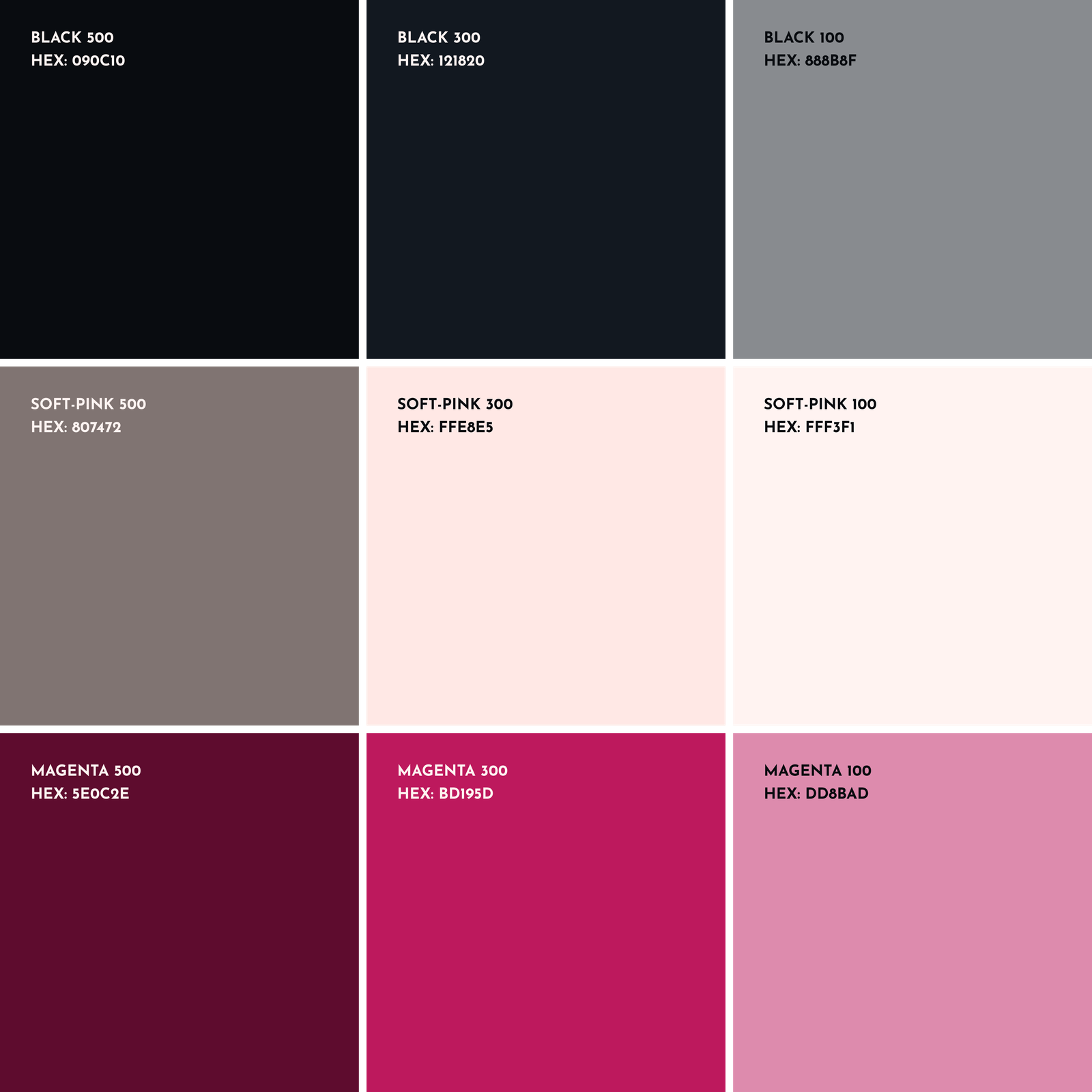
I started with colour.
The redesigned system was built around three core colour tokens: Footy's existing magenta brand colour, a black surface colour, and an off-white for contrast and structure. Each token was then expanded into a wider range of shades to support different interaction and interface states across the product.
This allowed the interface to handle:
- active and inactive states,
- emphasis and de-emphasis,
- feedback states, and
- layered hierarchy,
while still maintaining visual consistency across screens.
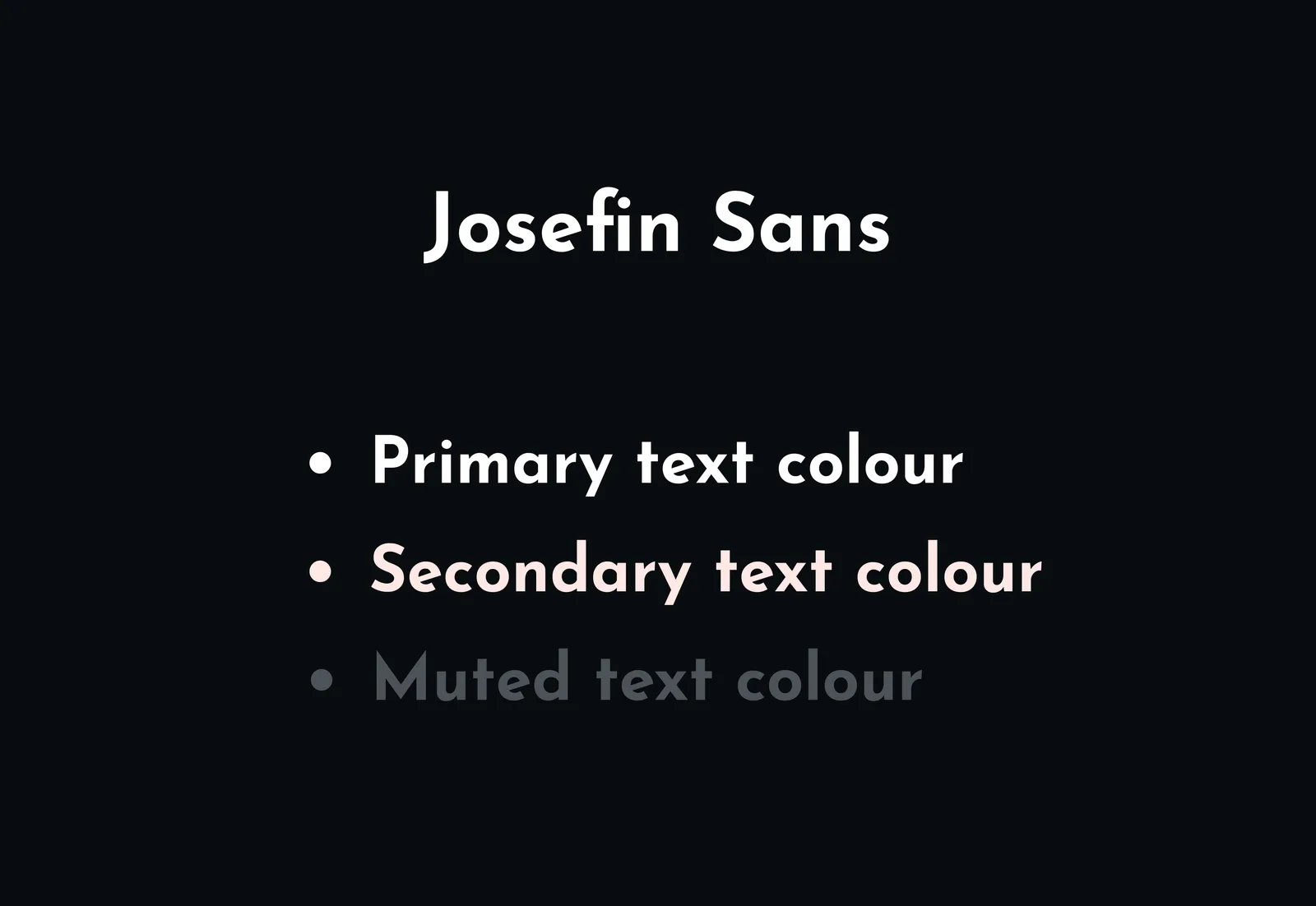
Next, I refined the typography system.
Because Score Square relied heavily on dense informational text, readability and scanning speed became more important than expressive typography. Rather than pairing multiple typefaces together, I chose a single typeface — Josefin Sans — with a wide range of weights that could create hierarchy while keeping the interface visually consistent.
This made it easier to:
- scan match information quickly,
- distinguish primary and secondary content, and
- maintain clarity across different interface states.
Clarifying Information Hierarchy
The first step in the redesign process was auditing the information displayed across the Score Square flow and ranking it by importance.
For every screen, I focused on two questions:
- What action is the user trying to complete?
- What information is essential to completing that action confidently?
This led to a simple hierarchy system:
- Primary information remained visible at all times because it directly supported the user's immediate task.
- Secondary information was still useful, but not critical in the moment. This content was either moved into modals or relocated elsewhere within the mini-app to reduce visual clutter.
- Unnecessary information was removed entirely when it did not meaningfully support the user's decision-making process.
This process significantly reduced visual noise throughout the purchase flow while preserving the contextual information users needed to understand match states, payouts, and transaction progress.
Clearer State Communication
The purchase flow relied heavily on state changes to communicate progress during transactions, making clear feedback especially important throughout the experience.
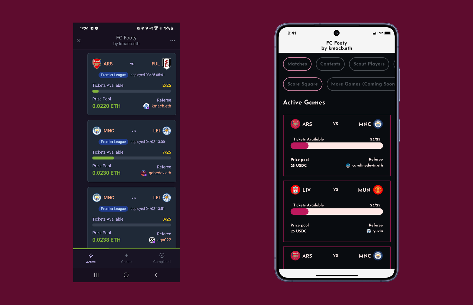
In the original interface, transaction states were split between the square-selection frame and a separate area above it. This fragmented the interaction flow and made important feedback feel disconnected from the action the user had just taken.
I redesigned the flow so that all transaction and progress states were communicated directly within the square-selection frame itself.
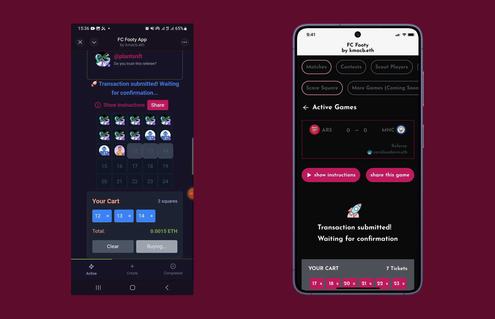
Before (left): the state change sat above the square frame.
After (right): the change updates the frame containing the squares itself.
This created a more cohesive interaction pattern and better aligned with the user's mental model: users naturally looked toward the square-selection area to understand what was happening during the purchase process.
By consolidating feedback into a single interaction surface, the experience became easier to follow and visually more predictable during critical transaction states.
The Outcome
The redesign tightened the visual language and interaction model of Score Square — turning an early prototype into a more coherent product.
Using the new visual system and interaction patterns, I designed the complete purchase flow — from arriving on the Score Square homepage to successfully buying squares for a match.
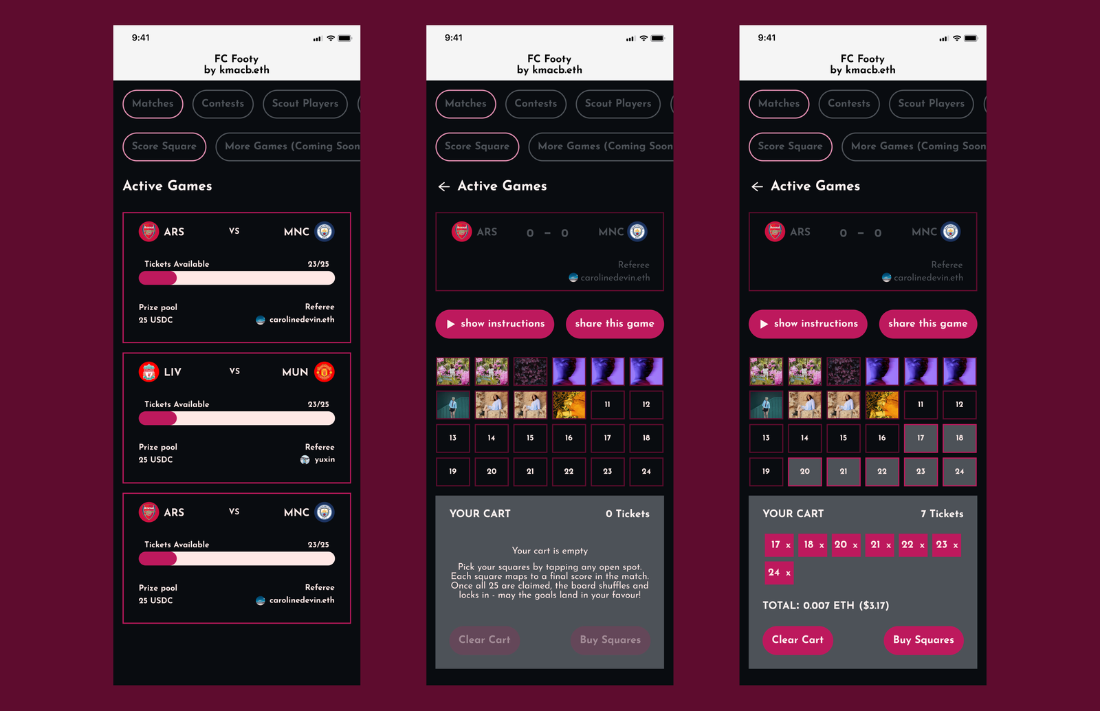
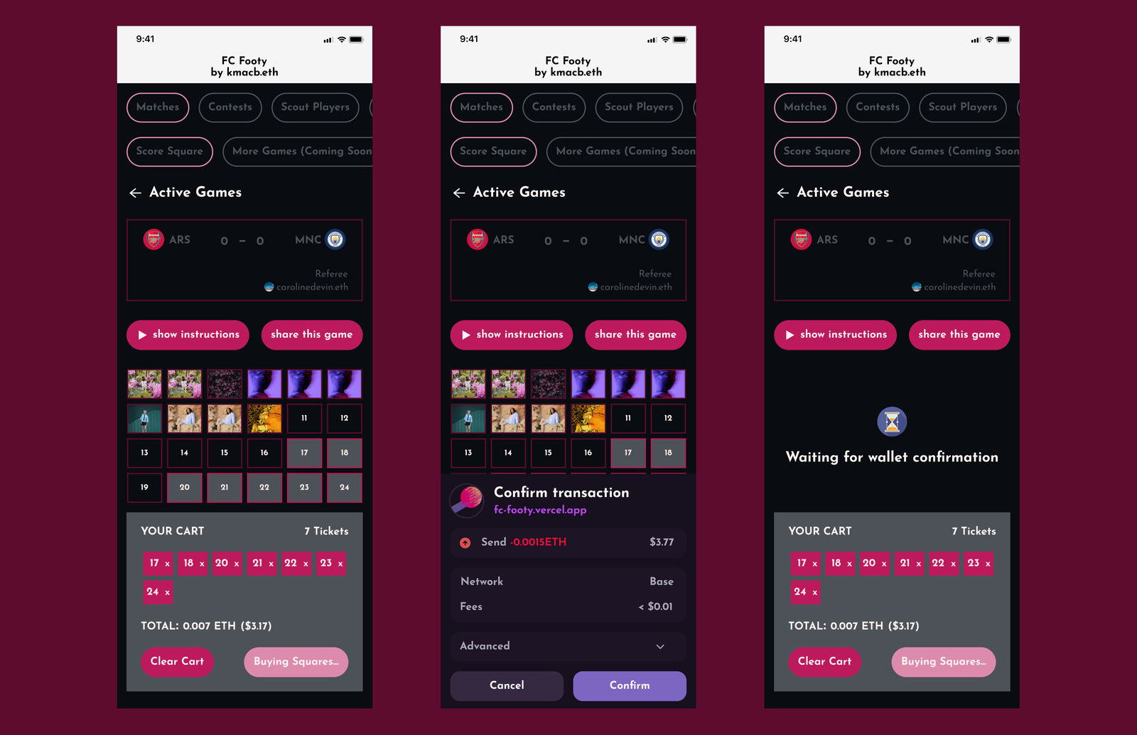
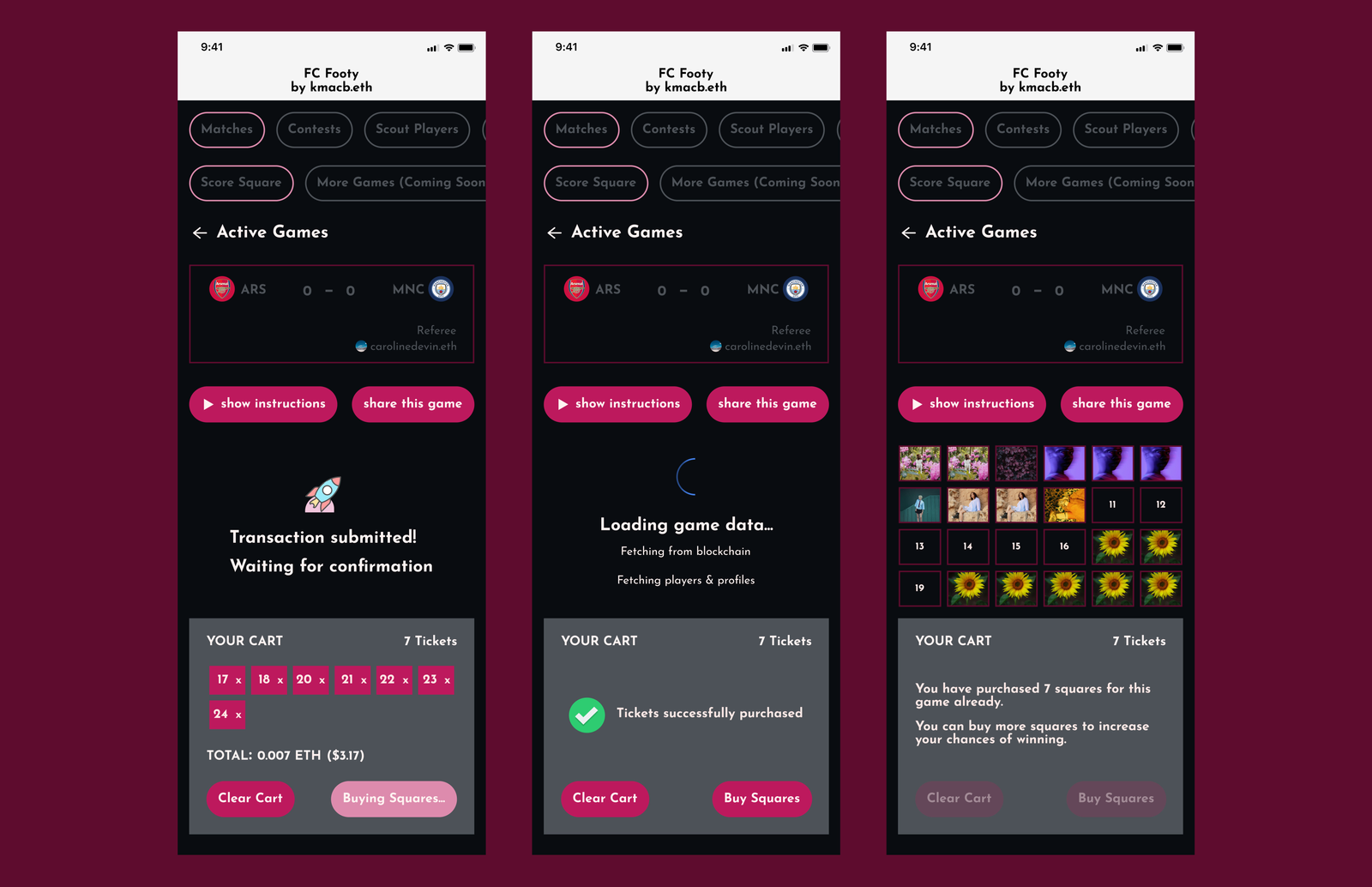
Although the flow spans multiple states, it was designed around a single core interaction surface. Beyond the entry point, every state is a variation of the same screen — sections updating dynamically as users move through selection, submission, and confirmation.
This approach helped:
- preserve continuity throughout the flow,
- reduce unnecessary navigation, and
- make state changes easier to follow during transactions.
Beyond the visual redesign itself, the project also established:
- a reusable foundation for future Footy features,
- clearer interaction patterns across states, and
- a more consistent interface language for the product moving forward.
The Reflection
Working on Footy reinforced the importance of treating interfaces as connected systems rather than isolated screens.
The most interesting challenge wasn't visual polish, but designing interaction patterns that could handle information density, rapid state changes, and transaction feedback without overwhelming users.
The project also pushed me to think more deeply about scalability — not just in terms of visual consistency, but in how interface decisions affect future product development, implementation clarity, and user understanding over time.