Energy
VISUAL DESIGNThe Overview
For my first solo design project after finishing Daniel Walter Scott's Figma Fundamentals course, I decided to design a website for a small retail jewellery brand. At the time I was shopping for jewellery so I was spending a lot of time on websites for jewellery brands and designing one felt like the right fit.
The Problem
Small jewellery retailers differentiates from the luxury jewellery brands based on price, they offer the everyday person jewellery at affordable prices. However, because there are so many players in this category seeking to serve a similar market, every retailer needs to find a way to stand out from all the others.
So, the objective was clear: build a modern jewellery website with a thoughtful selection of brand and visual elements to convey a sense of understated elegance at a great price.
The Design System
To begin, I explored a few similar websites trying to gain a feel for what a good jewellery website should look and feel like. I spent quite a bit of time on the websites of brands like en route, ShopLamy, and Chrono24.
I took note of things like navigation patterns, colour palettes, and layout patterns, and while I did not try to copy these things wholesale, they heavily influenced my design decisions. Some pages from the websites I visited are featured in the moodboard for the project below.
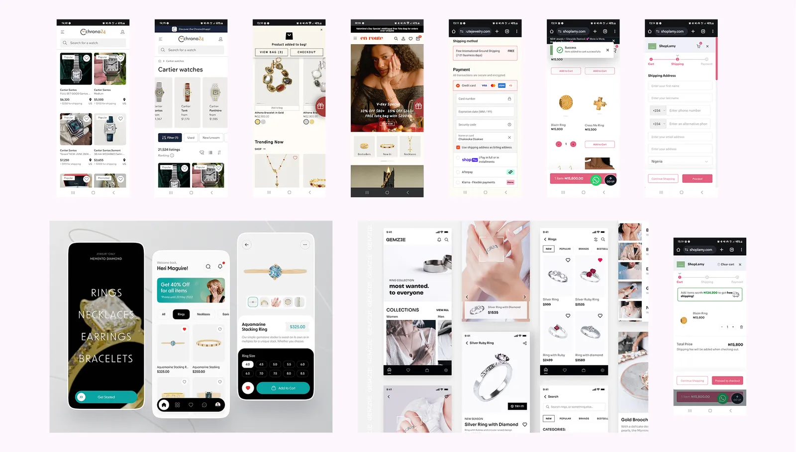
Some takeaways from looking at these websites include:
- Visual consistency is key. This is especially important for the UI cards showcasing the products, when navigating the website it should always be clear when the user is looking at an item for sale. However, beyond that, it's important to maintain the same clear visual language across the website and even beyond the website to things like social media posts. Users should find it easy to identify the brand wherever they come across it.
- Information prioritisation is important. Your user needs to know something about the piece of jewellery they want to purchase. But there is so much information that can be displayed for any piece of jewellery that it's really important to prioritise and try to show the user the most important information at every point.
- Simplicity is golden. On account of how much information needs to be passed across and the fact that images play a big part in showcasing jewellery, these websites can become cluttered, with text, images and other UI elements all vying for attention. The best websites find a way to cut through all the noise and present text, images, and UI elements in a simple, tasteful manner.
With sufficient information gathered from the research phase, I began designing. First, I made a simple design direction template to set out the typography, colour styles, and brand logo I would be using going forward. The template served as a guide to create and iterate on UI elements and components while keeping a consistent visual feel.
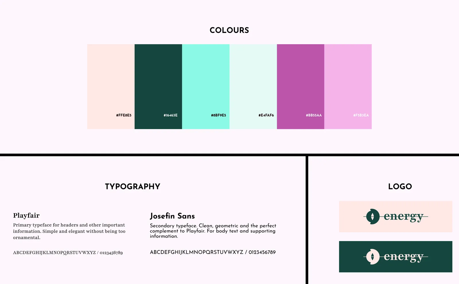
Then, I settled on some general guidelines for the feel of the brand.
- Brand Style: Simple luxury and affordable, expressive, personal, understated elegance.
- Target Audience: The fashion-forward youth, and anyone with a strong sense of personal style.
- Brand Tone: Energetic, confident, and inclusive.
For the brand name I chose "Energy" because I wanted something simple, easy to recall, and meaningful. These jewellery pieces are supposed to help buyers showcase their bold, energetic selves while still retaining elegance and a sense of style.
"Energy" captures the sense of vitality, personality, and motion that is perfect for a brand dedicated to understated luxury for the fashion-forward youth, and those whose sense of style makes them young at heart and in appearance.
For the logo, I chose to use the brand name as a wordmark in combination with a stylised monogram designed to look like a jewel abstracted away and flattened. I used the serif typeface for the wordmark to convey the sense of understated elegance, and the line running clean through the monogram and wordmark adds a modern and contemporary feel.
The Outcome
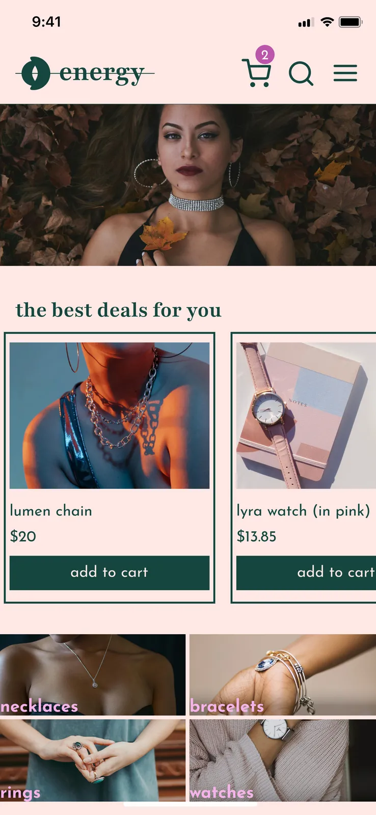
To bring the brand to life, I made four main pages, all fully functional (all four pages are shown below).
Homepage: This serves as an entry point into the world of Energy, especially for first time visitors — with featured product selections and categories designed to help the user find what they need easily while clearly showcasing some of the best offerings available.
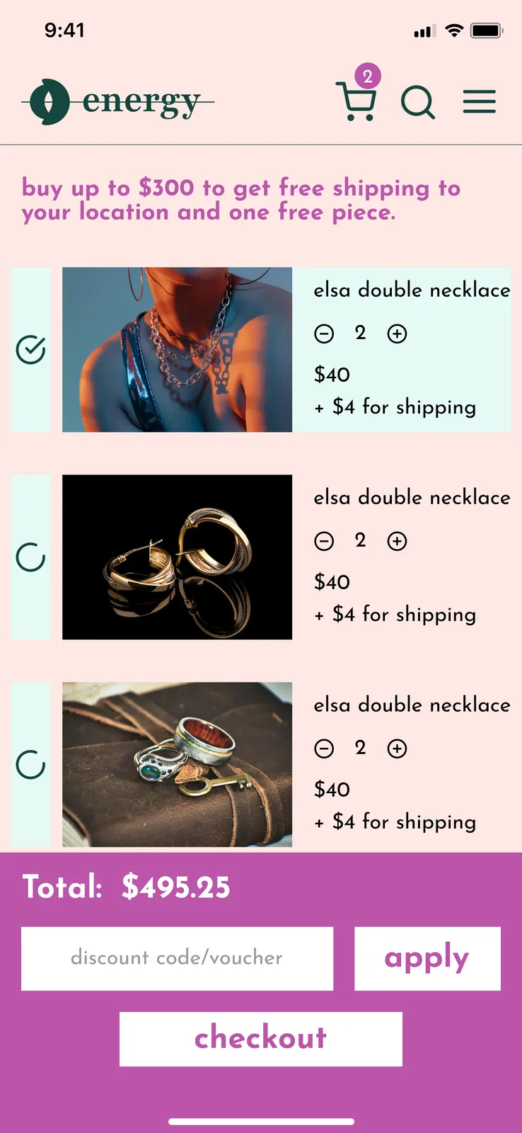
Cart Page: This page shows every item the user has already selected as well as details such as the quantity and price of each selection. Includes options to update quantities, remove products, or checkout some items and leave others behind.
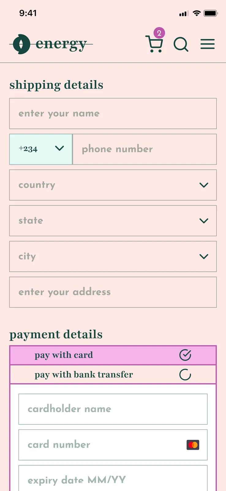
Checkout Page: Here the user enters shipping details and payment information, with the ability to choose between one of two payment methods. The total amount payable is displayed as well as a breakdown showing how that amount is arrived at. This includes the cost of each item, the total cost of shipping, and other variables like any tax payable on goods or discounts available.
Confirmation Page: This page provides reassurance to the user that the payment has been processed and their order is on the way.

To show what the entire experience looks like in real time, I made a walkthrough video simulating the experience of a user browsing the website and then trying to purchase something.
The Reflection
This project was my first time taking a design brief and creating the design for a fully functional website from that brief. It introduced me to the necessity of having a design system to enforce a consistent visual language as a design project grows. I also came to appreciate the necessity of designing around the specifics of a particular project — a jewellery website needs certain considerations that a website for a B2B SaaS company does not. Onwards!