Bribe
VISUAL DESIGNThe Overview
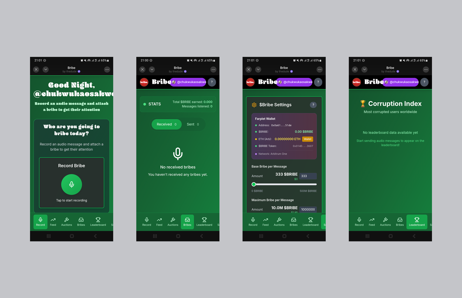
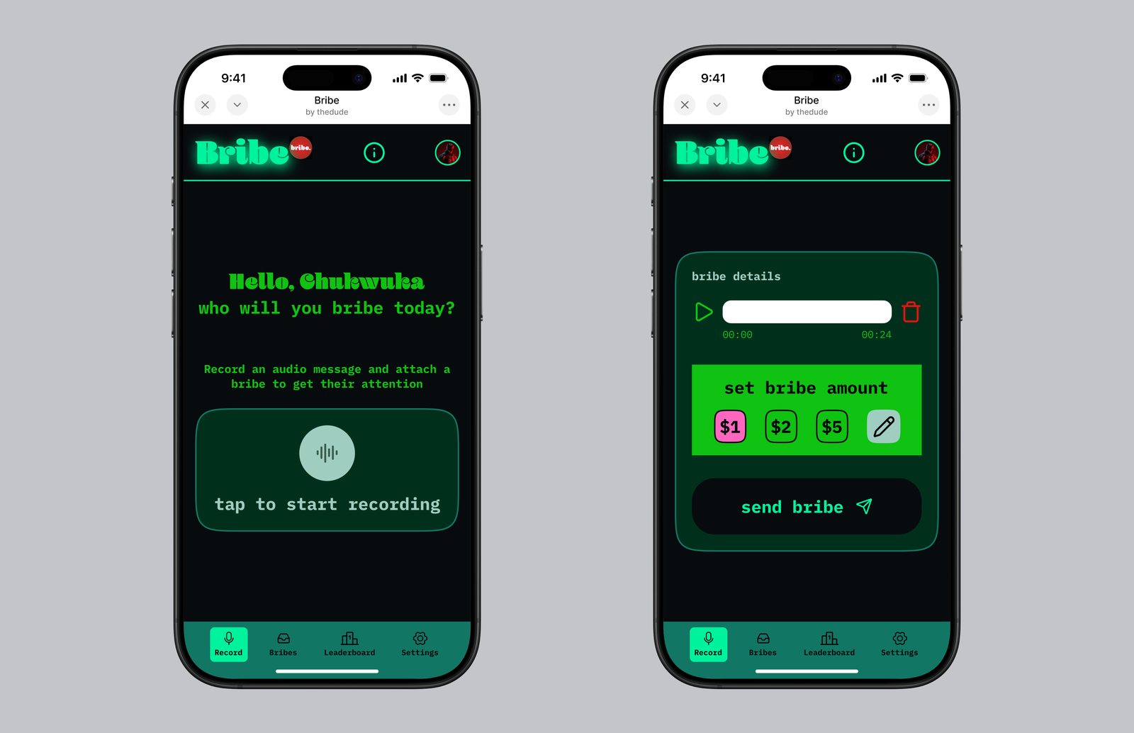
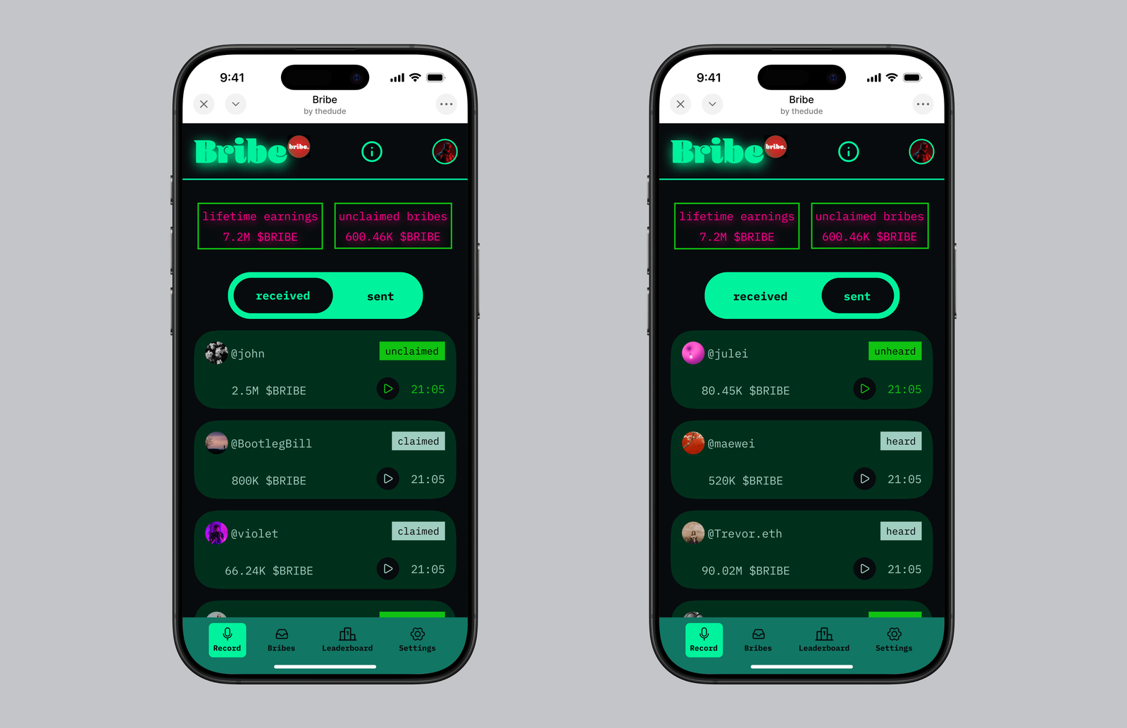
Bribe is a Farcaster mini-app for sending and receiving voice notes. The catch is that voice notes come with bribes attached (hence the name). Listening to a voice note enables you to claim the bribe attached to it. And if you want to get someone's attention, you can send them a voice note with a bribe attached.
The Problem
Given the technical constraints of a Farcaster mini-app and the narrow scope of this experiment, the ask here wasn't to redesign the UX top-down or to create a design system for an expanding product.
What I needed to do was quite straightforward: overhaul the visual language and give Bribe some personality. Make it look better, and make it stand out in the imaginations of the people who will encounter the mini-app.
The Design System
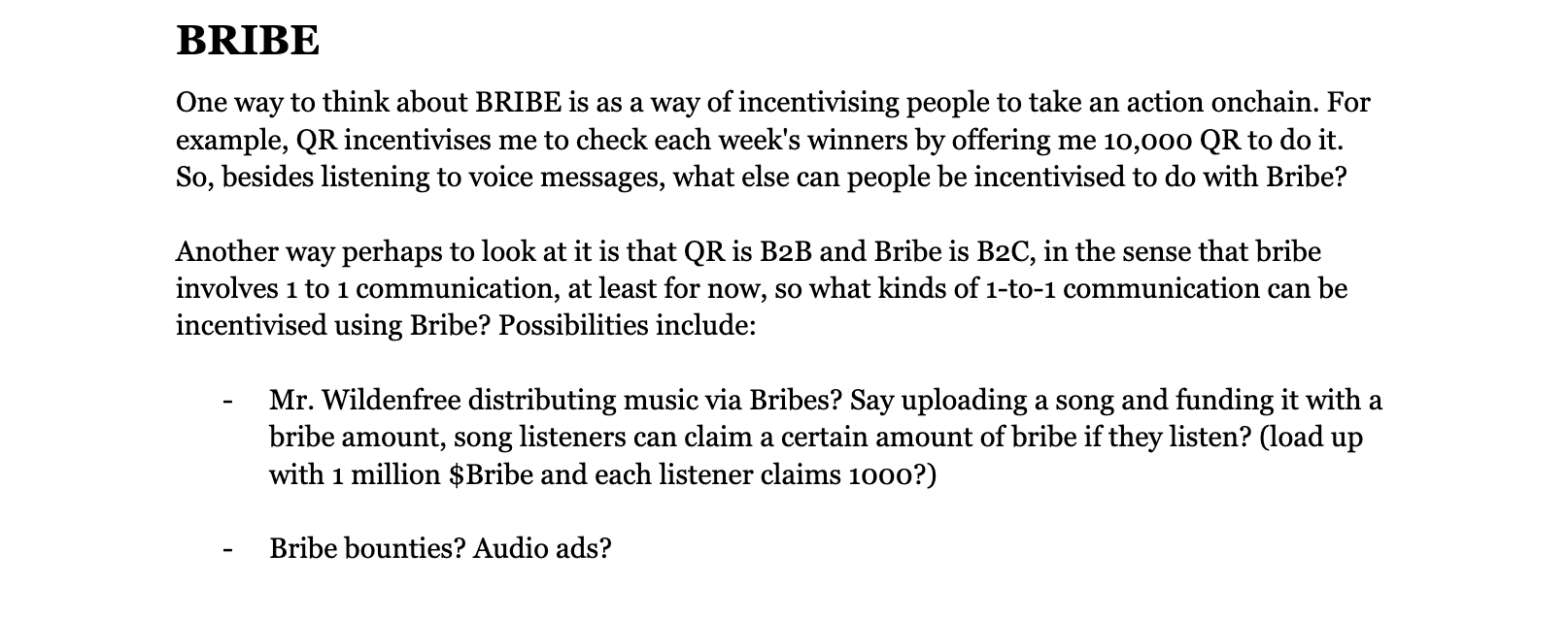
A lot of writing went into the design of this one. First, I tried to define the product, figure out its place in the Farcaster ecosystem, and throw out possible new directions for the product to take eventually.
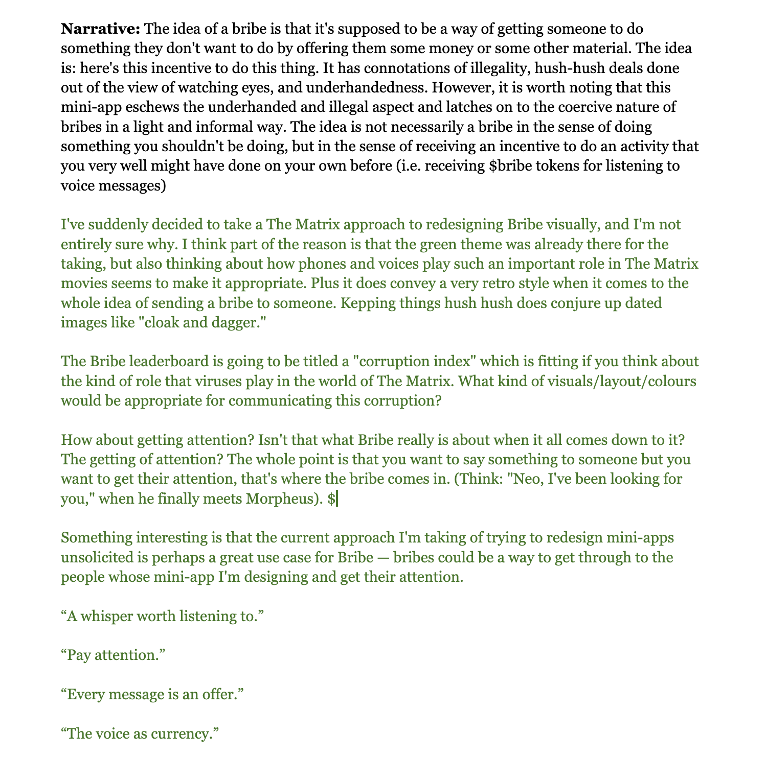
Then I started thinking about a narrative to tie it all together. I'd learned, by this point, that it's important to ground your redesign in a good narrative. A story, if you will, about what the product is, what kind of feelings it evokes (or should evoke), and what connections those feelings may have to real-world things from which you can take further inspiration.
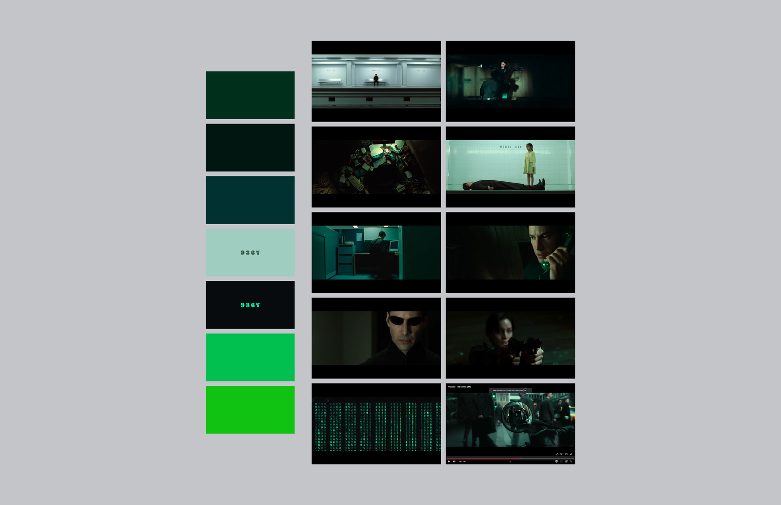
In the case of Bribe, I ended up going with a narrative grounded in the Matrix movies.
Once I'd settled on this direction, I took a lot of screenshots of scenes from the Matrix movies and tried to extract a colour palette that closely matched the feel of the Matrix.
For typography, I kept the Blenny font for the Bribe wordmark, but given the Matrix leanings of the redesign, I chose IBM Plex Mono for body text. IBM Plex Mono is at once very readable while also looking very technical and engineered. It's the kind of typeface that evokes a "machine" feel — even if you can still read the words, it looks at once like what a developer uses in their journal, and what Agent Smith might use in communicating with his copies.
The Outcome
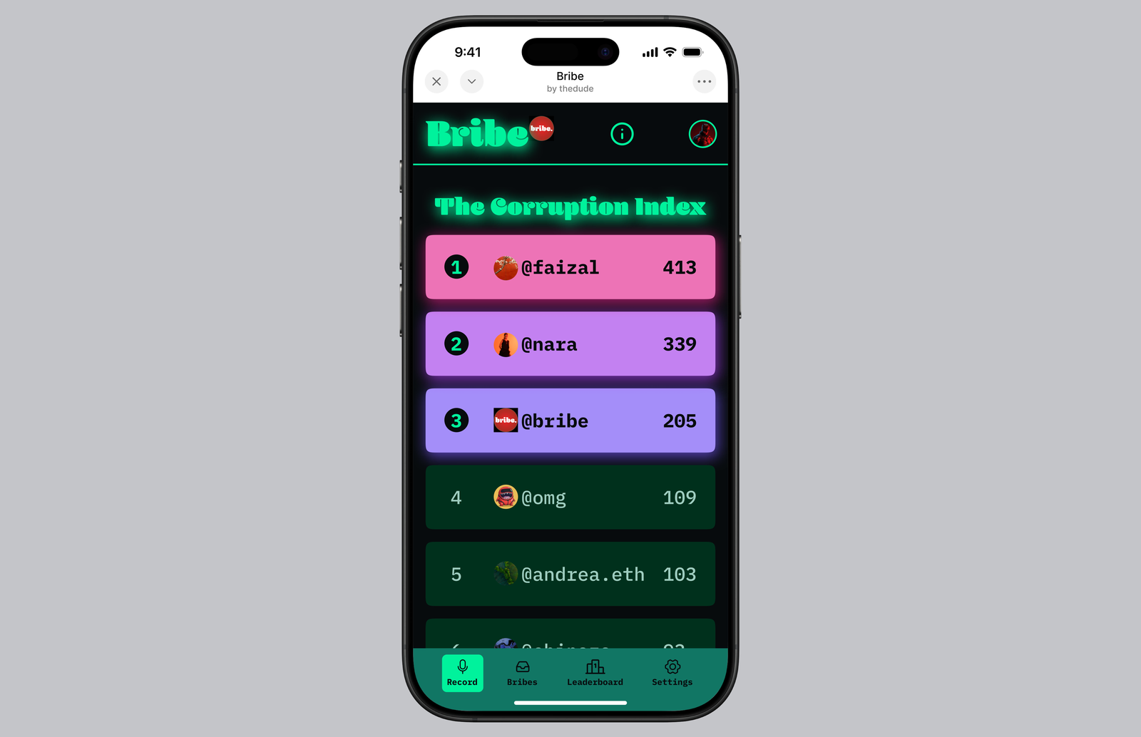
With Matrix connotations, a new colour palette, and a complementary body type in hand, I redesigned all the existing screens.
The Reflection
Making digital rain animation all by hand in Figma is hard. That part of the project required more thought than any other, and I still don't think I nailed it — in the end, I had to resort to asking an LLM to give me digital rain code.
Besides digital rain, I learnt how important narrative is to designing (all credit to Antimo for pointing this out to me). It's one thing to take something and redesign it and give it a better visual look; it's another thing when you do take the time to find a narrative to build it around. Finding a narrative gives a clearer direction and ties everything together — from the visual language of the app to marketing copy and the brand's tone of voice.